Refine 23
Moodboards
When designing experiences that don’t exist within an already-defined design language, moodboards can be helpful for communicating different aesthetic directions to stakeholders. The activity of curating imagery provides an opportunity for the design team to align on design directions through the exploration of brand and existing materials, aesthetic trends, and other input.
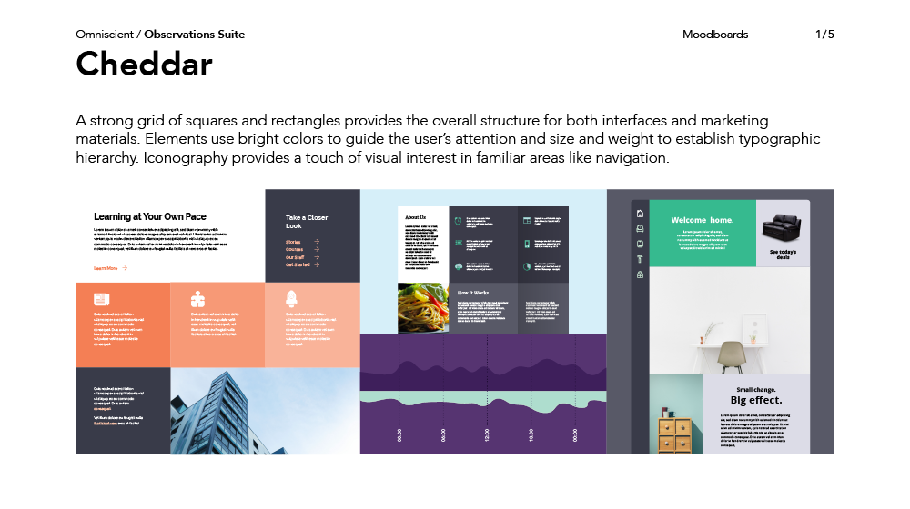
Typically presented as collages of imagery around a theme, moodboards avoid questions about features and interactions, focusing instead on conversations about elements such as color, typography, and motion. By sharing with stakeholders, a design team can observe initial reactions to how a product or service looks or feels. Later activities, like gestural design and mock-ups, should use moodboards as a guiding light, ensuring that the vision survives execution.
Buy from Amazon Buy ElsewhereOmniscient
Observations Suite
Moodboards for Observations Suite capture four possible directions for the new product. Each focuses on a variety of ingredients, but all have a point of view about visualizations—one of the central elements of the design. These directions were refined and used to inform gestural design.
Related Chapters
03
Competitive Analysis
Are other companies solving similar problems? What are their solutions? What are their unique selling points?
07
Trendscape
Can I learn from other companies? What non-adjascent experiences can offer relevant input to my project?
24
Gestural Design
What different ways could our product or service look and feel? How do we align stakeholders on a single aesthetic direction?
25
Mock-Ups
How does our product or service look, feel, and sound? How do we communicate this simply to stakeholders?
