Refine 20
Information Architecture
For rich experiences with multiple interactive parts, an information architecture captures how the different features will be organized and accessed. Most project work that’s already been done is relevant to this process. Take into account the features that need to exist as well as the user’s needs from key scenarios. Consider the user’s intuition captured by the conceptual model, and look at how others have organized features through competitive analysis and trendscape activities. Use experience principles for guidance when making decisions about what to prioritize and what to deprioritize.
The information architecture will help business stakeholders see how users will engage with the experience, will give developers an initial idea of how they’ll be implementing features, and will provide a draft navigation structure to the design team. It is the foundation for many activities that follow, so it’s important to give yourself enough time to work through the details and to get stakeholder commitment before charging ahead.
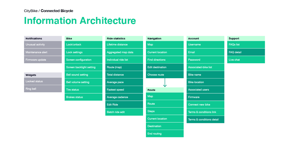
Buy from Amazon Buy ElsewhereCityBike
Connected Bicycle
The information architecture for CityBike is simple and straight- forward, drawing inspiration from mapping and fitness apps. The shallowness of the structure makes for a better experience, even while riding a bike.
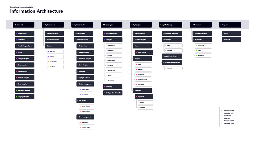
Omniscient
Observations Suite
Observations Suite has a more complex structure where every overview has details and interactions that the user can dig into. The information architecture focuses on the web app and offerings, along with how features will expand over time.
Related Chapters
11
Conceptual Model
How do users understand my product or service? What relevent knowledge and expectations do they already possess?
13
Feature Definition
How do we keep features user-centric? How do we capture all aspects of a feature so that they don't get lost?
21
Interaction Model
How do we organize all of our features so that the user can intuitively access all of them?
22
Function Hierarchy
How do we keep from overwhelming the user? How do we prioritize what a user sees and interacts with?

