Examples
Connected Bicycle
CityBike is a company focused on making accessible commuter bikes. Last year they created a proof of concept for their Connected Bicycle, and they are now seeking to refine the bike, on-bike display, and app for launch across Europe, Asia, and North America. We were approached by CityBike six months prior to launch to refine the rough design and to choreograph the experience of riding Connected Bicycles through the city.
This project has a tight timeline and will cover all four phases of experience design. Fortunately, because CityBike already has a proof of concept, a good deal of thinking already exists. The first part of this project will focus on understanding urban cyclists as well as uncovering existing decisions and problems with the current product. Immersing the team in an urban commuting culture and conducting an experience audit will provide firsthand experience, while user and stakeholder interviews will provide insight into specific needs of users and constraints of the product. From here, the team can get started on foundational design work like experience principles, feature definition, and key scenarios. Then design can work with users to refine the feature set and to define the ideal on-bike experience. The team can create an information architecture and multiple design variations before locking down on a single solution for implementation. For the last eight weeks of the project, the design team will integrate with implementation in two-week sprints to design, document, prototype, and test with users.
This project proposes a timeline of sixteen weeks, with the first half focused on discovering and defining, and the last half focused on refining and building. Checkpoints occur throughout the project timeline to ensure that all stakeholders stay aligned.
Discover
Immersion
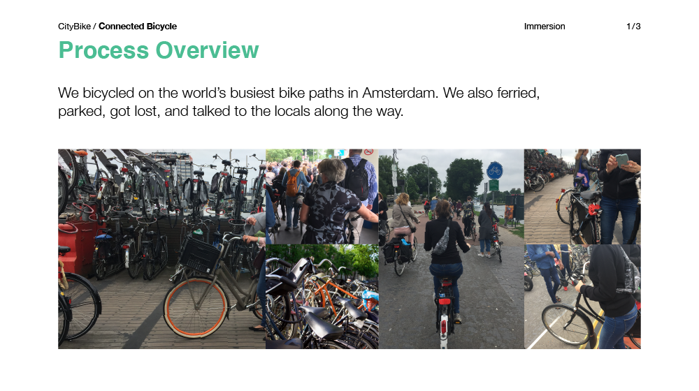
Immersion for CityBike covers ten days of getting to know one of the busiest bicycling cities in the world—Amsterdam. Insights cover experiencing bicycling in both known and unknown terrain.
Discover
Experience Audit
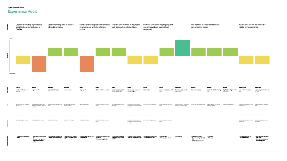
CityBike’s experience audit takes the experience journey and maps its strengths and weaknesses. Opportunities for improvement are called out as they relate to the journey, while specific areas for improvement are called out below.
Discover
User Interviews
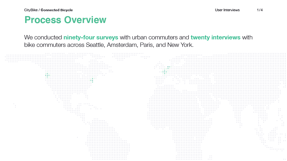
CityBike user interviews look at commuting behavior in general via surveys and bike commuting specifically through in-person interviews. Output highlights current user behaviors alongside users’ stated needs.
Discover
Stakeholder Interviews
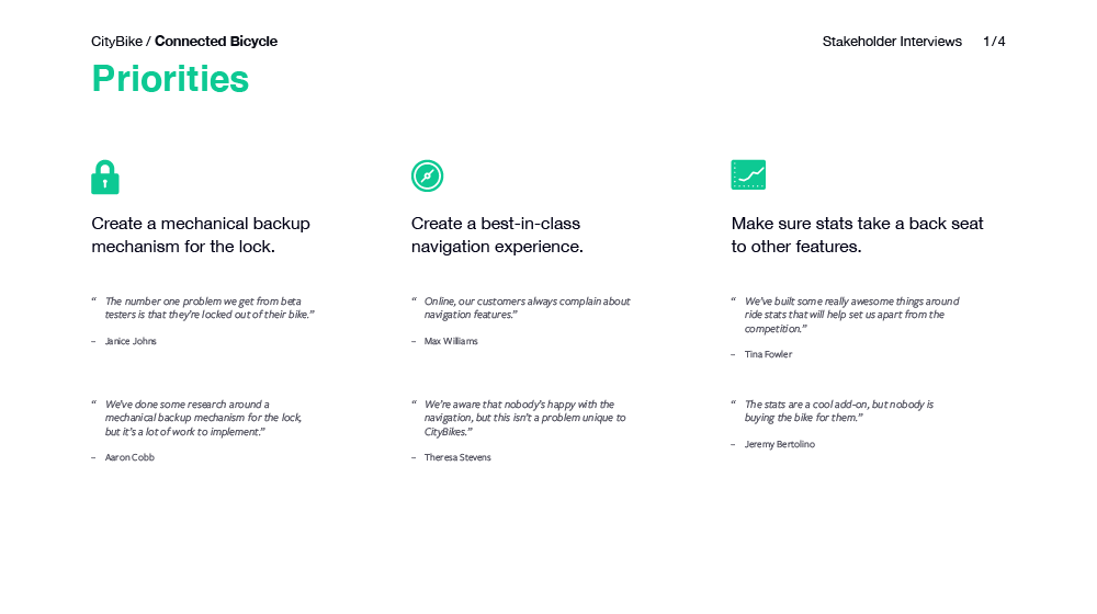
Stakeholder interviews for CityBike focus on getting to know team members’ priorities and understanding all of the work and input that’s been done to date. The output highlights priorities for design backed by quotes from stakeholders, as well as risks to the project.
Define
Experience Principles
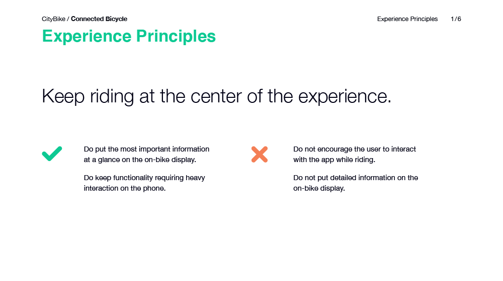
CityBike’s experience principles describe how screens should be used to support the user’s experience with the Connected Bicycle, rather than dominating it. Principles are supported with examples of both good and bad decisions.
Define
Feature Definition
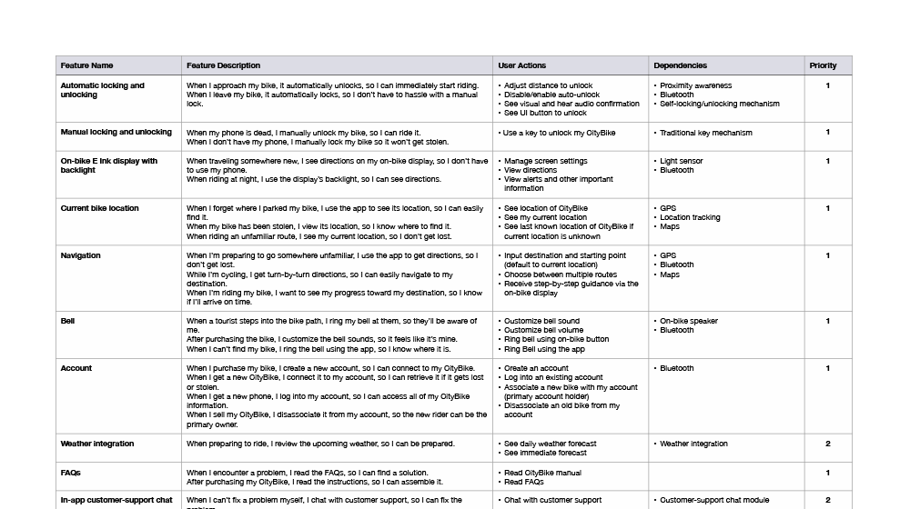
The design team helped make CityBike’s features more user oriented by adding user actions and contexts to existing stories.
Define
Key Scenarios
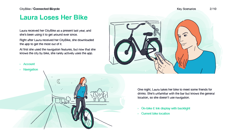
Key scenarios for CityBike follow three personas through their experiences with the product. Backgrounds change to capture when things are going as expected and when things go wrong.
Define
Participatory Design
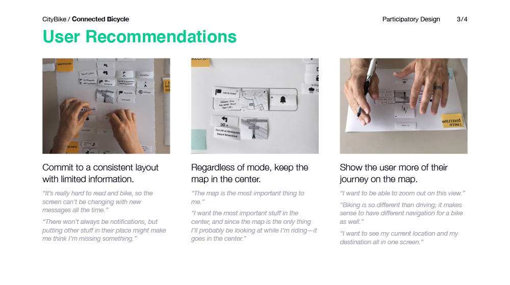
CityBike worked with users to design their ideal bike display based on a series of features. Users could also add their own features. To warm users up, each session began with a ten-minute session of city bicycling.
Refine
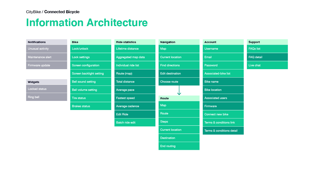
Information Architecture
The information architecture for CityBike is simple and straightforward, drawing inspiration from mapping and fitness apps. The shallowness of the structure makes for a better experience, even while riding a bike.
Refine
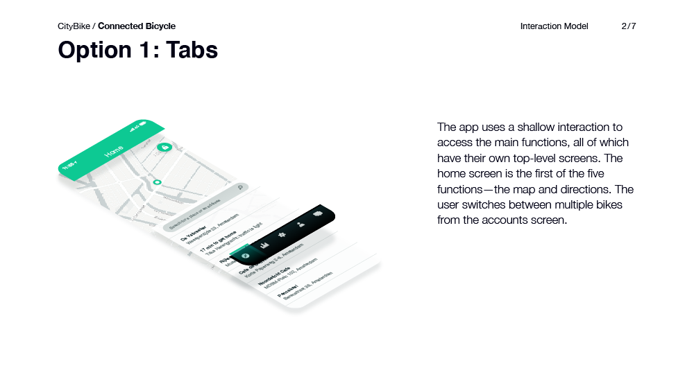
Interaction Model
The interaction-model artifact for CityBike shows three options for how the user might navigate through the app. Each option has a map showing how the user gets to the top-level parts of the information architecture, as well as a 3-D diagram to show the structure of the different elements on a screen.
Refine
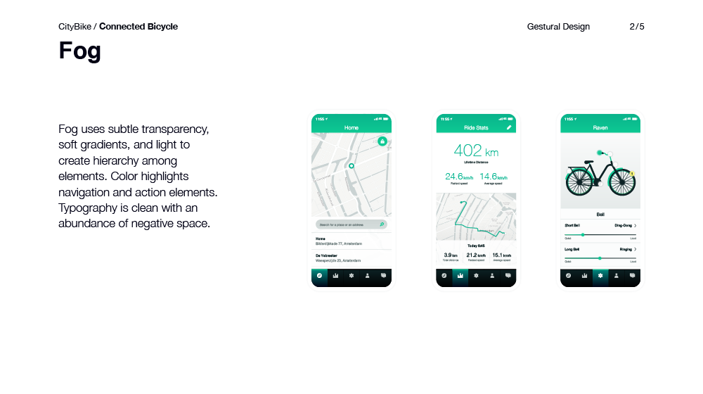
Gestural Design
CityBike uses gestural design to explore different interaction models and aesthetics specifically for the Connected Bicycle’s app. Each direction is distinct, despite making use of on-brand typography, iconography, and color palette.
Refine
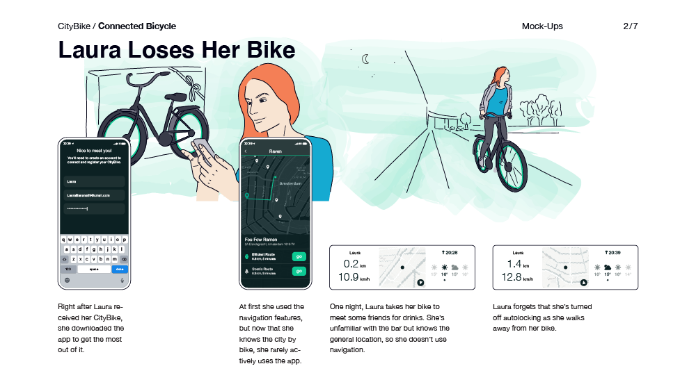
Mock-Ups
Mock-ups for CityBike’s Connected Bicycle are presented in the context of key scenarios, providing stakeholders with a view into how the user will engage with both the on-bike display and the app over time.
Build
Component Library
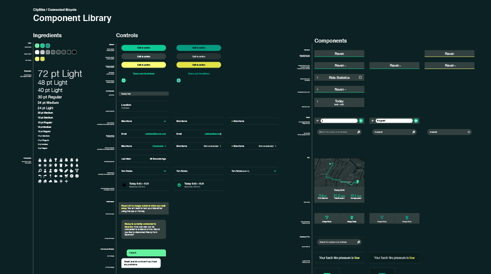
The component library for CityBike’s Connected Bicycle focuses on capturing key elements of the app for building out the design and communicating basic behaviors to the development team. Hardware and on-bike display component libraries are maintained separately.
Build
Flow Diagram
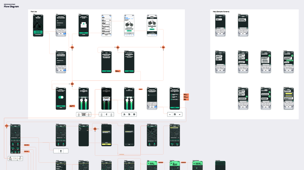
Excerpts from the flow diagram for CityBikes capture the states of the mobile app alongside the related states of the on-bike display. The diagram is relatively simple, avoiding the details of error states and transitions.
Build
Prototype
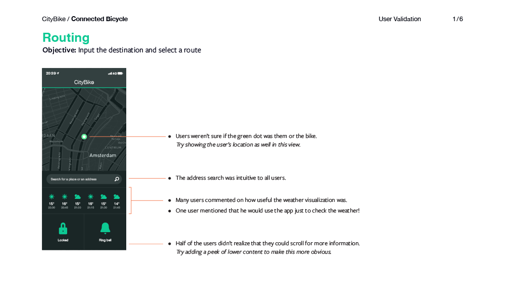
CityBike uses a simulation prototype to validate the design with users. The prototype encompasses a subset of the app experience, ensuring that the user can navigate the experience to perform a key selection of activities.
